a 22-minute read | Editor’s Note: This post was originally published in July 2020 and has been updated in September 2020 for accuracy and comprehensiveness.
You’re reading one of the most complete overviews of landing page best optimization practices on the internet. We’ve pulled together 27 ready-to-use tips that you can put into action right away. They were specially selected to help businesses improve lead conversions and landing page optimization.
Having said that, every business is different. Take what you think makes sense, and leave the rest. Don’t stuff your landing page with “extras” because we mentioned them here. Remember that less is more.
So let us start with a question:
Why should a lead want to buy from you? – “Because I only sell the best!”
Okay – but what specifically about your landing page would convince a total stranger to buy from you? Does your headline speak directly to their needs and goals? Does your CTA promise to do something they actually want to accomplish?
Get details like these on-point with landing page optimization, and your landing page can bring in more leads than you ever thought possible – seriously. So many leads you’ll have to scale up your staff just to keep up with them all.
How do we know? Because we’ve made it happen for our own clients.
But it’s only going to happen for you if you streamline your page into a precision-targeted machine that does one thing only: gets qualified leads to click that opt-in button. Here are 27 tips that will help you do this:
- Start from your customer’s end goal, and work backward
- Stay focused on ONE overall selling point
- Make your page look unique (i.e., don’t use a boring template)
- Keep the most important stuff “above the fold”
- Search-engine-optimize your page’s title
- Make sure your landing page copy matches your ad
- Accelerate your views with social media buttons
- Build trust with testimonials
- Use trust symbols to prove you’re legit
- Play up the social proof
- Make sign-ups as simple as humanly possible
- Make it easy for your leads to contact you
- Grab 100% of visitors’ attention with one simple statistic
- Break up your features into bullet points
- Use POWER WORDS
- Make a limited-time offer
- Use action words in your CTA
- Make your CTA button stand out
- Get rid of unnecessary links
- Give people something in return for their contact info
- Run A/B tests on your landing page
- Create different versions for different customer segments
- Share a video (that people actually want to watch)
- Consider using exit popups… sometimes
- Point your visitors in the right direction
- Draw attention to the most important elements
- Keep everything positive
1 | Start from your ideal customer’s end goal, and work backward
Writing a perfect headline can be a tricky business. That’s why some businesses try to pack everything and anything into their headlines:
“For Top Quality Custom Car Accessories for All Brands, Delivered Worldwide in 10 Days or Less!”
It’s a lot of information, packed in fast, and it will leave any reader exhausted just from reading it. But there’s an easy way out of this headline trap. Just ask yourself: “What’s my ideal customer’s main goal?” That, right there, is your headline and the main theme of your page. For our dizzying headline example above, a benefit-focused headline might be:
“The car parts you need, in 10 days or less. Guaranteed.”
The lead doesn’t care that you have all the parts for every possible car. They don’t care that you ship everywhere in the world. All they care about is that you have the parts they need, and that they will receive their order on time.
Figure out exactly what your lead’s goal is. Write a headline that fulfills that goal. Then build all your messaging, images, layout, and everything else around that headline.
2 | Stay focused on ONE overall selling point
The easier your offer is to understand, the higher your lead conversion rate will soar. This doesn’t mean, of course, that everyone will want what you’re selling. You’ll still get a lot of bounces – in fact, a bounce rate of 80 percent is totally normal, even after all-star landing page optimization efforts.
But here are a few things that’ll grab attention:
- Use specific dollar values.
Your TVs cost “only $2,995,” rather than “just a few thousand dollars.” - Use non-round numbers.
For some reason, people find $2,995 easier to believe than $3,000. - Numbered lists sound official.
Instead of listing “lots of reasons” to buy from you, list “The Top 5 Reasons.” - Skip the fine print.
Eliminate every word that distracts from the “Buy” button
Your TVs are affordable, you offer free shipping – but what does your lead actually want? They want to watch the next important game on a big, clear screen. Zero-in on that primary selling point, and make sure everything on the page supports it when doing landing page optimization.
3 | Make your page look unique (i.e., don’t use a boring template)
“But some of the latest WordPress templates look really professional!” They’re great – if you’re running a personal blog. If you’re trying to build a high-converting landing page, though – what’s every visitor going to think, the second they lay eyes on it?
“Oh look. It’s that same WordPress template I’ve seen a thousand times.”
[closes browser tab]
Nothing against WordPress here. Some of their custom templates really do look professional – and if you put in some time really personalizing them, they can look totally unique. What’s definitely true, though, is that we all know an overused website template when we see one. And an overused template does not inspire confidence when it comes to lead conversions.
Don’t be “that person.” Invest in a good web designer – or at the very least, choose a template that doesn’t look like every other high school blog out there, and put in some time making it look unique. Even if all your other content stays the same, a simple change of site template can give you a huge boost in lead conversions. We’ve seen it happen in our own landing page optimizations.
4 | Keep the most important stuff “above the fold”
In a real paper newspaper, the biggest headline always goes on the front page, above the first fold. The exact same principle applies to landing pages, except by “fold,” we mean “the bottom of the visitor’s browser window.”
In other words, they should see everything you need them to see, without having to scroll down. That’s because most of them will never scroll at all. The vast majority of visitors will either click your CTA button without scrolling down, or they’ll bounce. That means the “above the fold” area of your page needs to include a 5-Point Punch:
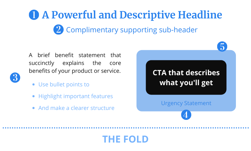
- A powerful and descriptive headline: Something that will instantly grab your attention and give you a reason to stick around and learn more.
- A complimentary supporting sub header: Give your headline a boost and help your customers put things into perspective.
- A brief benefit statement: Go straight to the point and describe the core benefits of your product or service.
- Urgency or special offer statement: Give people a reason to take action right now using a limited time or limited quantity offer.
- A CTA that describes exactly what you’ll get: Entice clicks by describing the proposed benefits directly into your call-to-action buttons.
All of that might sound like a lot, but it’s actually not that much. You’ll have plenty of room for that all-important whitespace, if you design wisely. Plus, it’ll force you to write copy that’s short, sweet, and straight to the point.
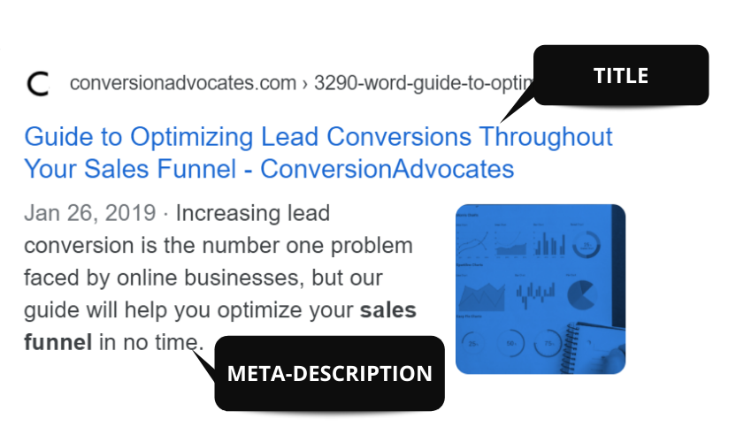
5 | Search-engine-optimize your page’s title
This doesn’t mean your headline. Title here refers to the title that shows up in the browser tab. Your page’s headline and subheader are important too – and we’ll get to those in a bit – but without an optimized page title, people will be a lot less likely to find (or even click on) your page link.
Keep your title short, and pack it with keywords relevant to your page’s main goal. Even more importantly, make sure to phrase your title according to the context in which people will search for it. Google’s filters keep getting smarter. Keywords used to be king, but context is taking over. Here’s what this means for you.
When Google’s algorithm scurries off in search of a page to answer a user’s question, it’ll keep a close (robotic) eye out for page titles that look super-similar to the question the user asked. For example, instead of a page title like, “50% Off Grand Canyon Hotels” – which almost no one will actually type into a search engine – use a title like, “Best Hotels in the Grand Canyon”.
The more similar your title looks to the user’s question, the more likely Google will bring back your page as a top search result.
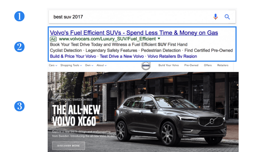
6 | Make sure your landing page copy matches your ad
And we mean matches exactly. For example, let’s say someone searches for “Best SUVs 2017”. Then your customer’s experience should look something like this:
But what if instead of sending them onto an SUV page, they land on a page with a headline saying, “Certified Pre-Owned”?
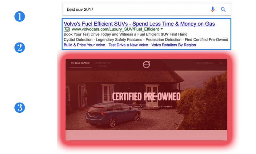
Right away, they would wonder if they’re on the right page.
It might not seem like a huge difference to you, not even to the visitor either, at first. What it does do is plant a small seed of doubt in their mind as soon as they land on your website. Why give them the opportunity to doubt at all when you can easily avoid it with a few tweaks to your landing page optimization?
People click on an ad because they like what it says. Make sure your headline and subhead use those same words, so visitors see the exact same text they clicked, the moment they land on your page. Then point them straight to a CTA that delivers precisely what they want.
7 | Accelerate your views with social media buttons
The more people share your page, the more likely it is to show up in searches.
The more people share your page, the more likely it is to show up in searches. A few social media shares can now boost your page’s rank more than inbound links from other websites. But that’s just the beginning of why you need social share buttons on your page.
People are 71 percent more likely to convert based on social media referrals. And social media buttons can boost a blog post’s stats by up to 700 percent.Sumo.com and similar free plugins make it easy to add social share buttons anywhere on your page – or even as an auto-scrolling sidebar. Take a few seconds, set them up, and start raking in the shares.
8 | Build trust with testimonials
We’ve already mentioned the importance of social share buttons for landing page optimization. Testimonials are another way of boosting referral-based conversions. Remember how people are 71 percent more likely to convert based on social media referrals? Every real positive review on your page raises that percentage.
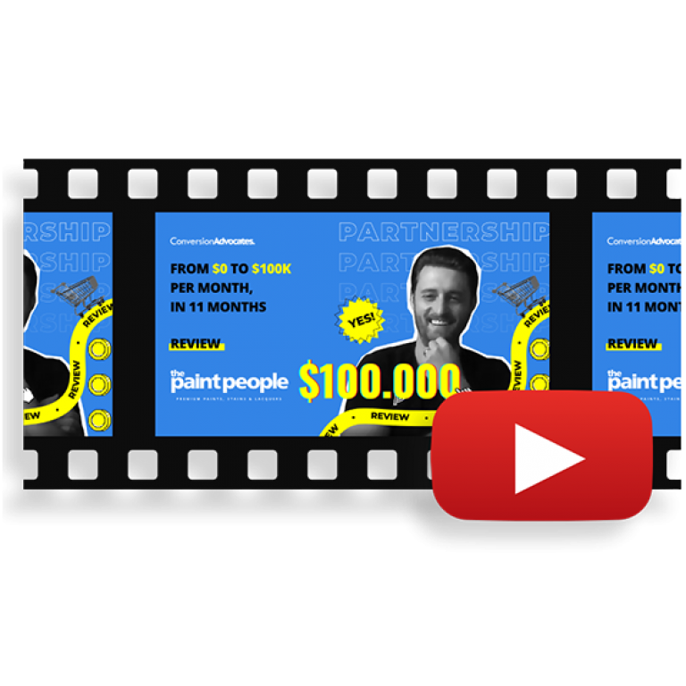
For example, we used to publish on our Wall of Love snapshots of emails we got from customers who used our old $297 Landing Page Analysis. And our conversions went through the roof! Customer testimonials look even more legit when accompanied by photos – or better yet, video clips – of real people who genuinely love your product or service.
In fact, a lot of businesses have found that the most successful landing pages of all are literally just huge testimonials from photogenic customers, with opt-in forms at the bottom. You can quite simply use a customer testimonial (with an attractive photo) as an ENTIRE landing page, and that page will convert in large numbers, possibly even more than your other landing pages.
9 | Use trust symbols to prove you’re legit
This is basically the corporate version of those photogenic customer testimonials.
You might be thinking, “But I don’t work with any big-name brands.” But you probably are, without even thinking about it. If you run a cleaning company, you work with name-brand cleaning fluids. If you make glittery dog collars, you use a certain brand of glitter. And if you’ve been in business for a while, you’ve probably also gotten good ratings on sites like Yelp, Amazon, Etsy, etc. Every industry, no matter how niche, has their own big names. Plaster those logos on your landing page. Make them easy to see.
Here are a few examples:
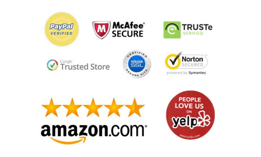
Visitors skimming your page aren’t going to take a ton of time to examine the logos and wonder what they mean. Most visitors may not even consciously notice them. And on their own, they’re not likely to grab you any more lead conversions.
But logos – otherwise known as “trust symbols” – make an impact all the same. In their own subtle way, they say, “We’re a real company. We work with other companies you know and trust. And other companies trust us.” Even if it’s just subconscious, your visitors will get the message.
10 | Play up the social proof
Tell your visitors how many happy customers you’ve got – and show them, too. This is known as “social proof.” We’ve already talked about using social media buttons, and stamping positive customer reviews on your page – and all these things are forms of social proof. But the general principle is even bigger when it comes to landing page optimization.
Invite your visitors to “Join 5,400 happy customers!” Encourage them to “Find out what 10,500 homeowners love” about your service. (Remember what we said above about not using perfectly round numbers.)
Photos paired with testimonials are another powerful form of social proof. When your visitors see photogenic people using (and loving) your product or service, they imagine themselves in those people’s shoes.
In short, everything you do as part of landing page optimization should reinforce the message that tons of smart people – people just like your visitor – already use and love your product or service. You want every visitor to think, “If I don’t opt in, I’ll be missing out!” That’s how powerful a single positive testimonial is.
11 | Make sign-ups as simple as humanly possible
Do you really need more than your visitor’s first name and email address? Nine times out of ten, no, you don’t – because they’re “just” leads.
And it’s a good thing, too, because that’s as much personal info as most first-time visitors will be willing to hand over. Your opt-in form (or sign-up form, or whatever you want to call it) should be an eye-catching box containing exactly four things:
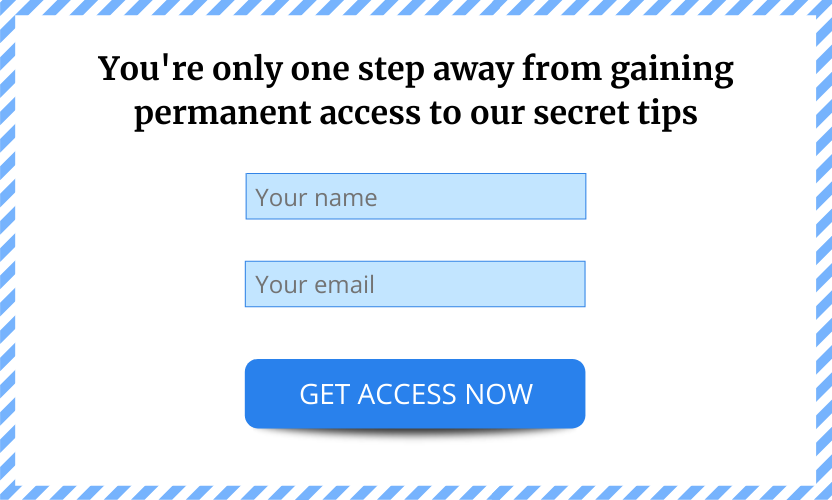
- An attention-grabbing headline (A/B test a few, and see what works)
- A “name” field
- An “email” field
- A CTA (call-to-action) button that says something action-oriented, like “Sign me up now!” or “Start my FREE trial!”
That’s it. Every other thing you want to add is a distraction, and will lower your lead conversions.
“But I need the lead’s phone number!” Why though? You’ve already got their email, which means you can start delivering valuable content to their inbox right now. (If you don’t have any valuable content to deliver to their inbox, then that’s a whole different problem, and we’ll be happy to help you solve it.)
“But what if they gave a fake email?” you ask. Then they were never serious to begin with, and you’ve just saved yourself a huge amount of pointless work. Count yourself lucky.
Get the lead’s name and email address. Start delivering valuable content to their inbox. Then, and only then, can you start to think about making a sales pitch and boosting your lead conversions.
12 | Make it easy for your leads to contact you
All right, so you’ve got a simple contact form with an action-oriented CTA. That’s a great start for landing page optimization – but what if a lead doesn’t want to wait for you to contact them? Make sure they know you can be reached by phone, by chat, by Skype, and on any other platform they’d like to use. Obviously, none of this info should distract from your main CTA.
You don’t want your lead to sit there wondering which action to take, then get distracted by a phone call (or a police siren, or a party down the street) and forget all about you. Just make sure they know you’re happy to talk, instant message, or chat, whenever and wherever they like.
13 | Grab 100% of visitors’ attention with one simple statistic
Your landing page already shows visitors how happy and fulfilled they could be if they purchased what you’re selling. But how much better would their lives be, exactly?
Maybe you can raise your clients’ revenue by 20%. Or decrease their processing time by 15%. You get the idea. The only big rule to follow with statistics is to keep it simple. Don’t drown your lead in numbers.
If you absolutely, positively, have to show off more than one or two statistics, put them into a cool-looking infographic or flowchart. Otherwise, stick to one big attention-grabbing stat, front and center. Kind of like we do in our case studies.
14 | Break up your features into bullet points
Nobody takes the time to read anymore! Before we launch into a monologue about bad attention spans and crumbling culture, let’s just be realistic. People just don’t read landing pages – they skim them, often on small mobile screens. That means, for optimal landing page optimization, you need to keep text to a minimum, make it as easy as possible to skim, and break it up in a way that makes your audience want to read more.
So, leave plenty of whitespace.
If you’ve got any text longer than four lines:
- Find
- A way
- To bullet-point it.
Another SEO-friendly way to make your text easier to read is to use various, but relevant subheading formats (H2, H3, H4, H5, etc). You can also use other simple tricks to highlight the most important words with bold, italics, ALL-CAPS or links.
WARNING: Do not use all these things in the same paragraph, obviously. That would defeat the whole point. The point is to make your text as easy as possible to skim. If it’s not easy to skim, then why bother putting it on your page in the first place?
15 | Use POWER WORDS
We’ve all heard writers throw around words like “punchy” and “pop.” But what exactly makes writing “pop?” The answer is surprisingly simple. Writing “pops” when it has…
[dramatic thunderclap]
POWER WORDS.
Does your workout program just “help people lose weight,” or does it “deliver dramatic weight-loss results?” You know power words when you see them, and you know there are two categories of them:
Once you get some practice, you’ll find that power words become second nature. Check out this list of 317 power words to get started.
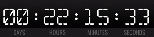
16 | Make a limited-time offer
Countdowns are everywhere. Yes, they can be cheesy. And sure, we all know they’re a little bit fake. But you know what? They’re everywhere because they work for boosting lead conversions. They are a quick and easy way to create FOMO – Fear Of Missing Out.
The simple combination of:
- A clear offer
- Discount in the form of a numerical statistic
- And a countdown timer
…is one of the most knock-out combos for any landing page.
Tell your visitor what they’ll get, how many other people love it, and how long they have to grab it, then watch your lead conversions shoot through the roof.
Why is this so effective? Because countdown timers create a sense of urgency. When people fear they have a limited time to make a decision, they’re more likely to convert right on the spot.
Time is running out! Add a countdown timer to your page today!
17 | Use action words in your CTA
Nobody wants to click a button that says something boring. Would your customers rather just “download the report,” or do they want to “read the FREE report NOW?”
All great CTA copy shares one thing in common: it’s action-focused. Make it the button that does The Thing.
A button with text like “Go” or “Submit” is not only boring – it tells the visitor absolutely nothing about what will happen when they click it. Never let your user wonder what the button might do. Once they start wondering, their attention drifts away.
Tell them exactly what will happen the instant they click that button:
– “Download my FREE ebook”
– “View my free report”
– “Begin my free trial” ← Although that’s a popular CTA, we would never use it. Why? Because nobody wants to start a trial that’s going to expire and ask for more money.
– “Import my data now” ← Again, a popular CTA, but one we’d never use. Why? Because it sounds like it’s going to involve boring work, and nobody wants to do extra work.
– “Start using the app NOW” ← There! Much better. See the difference?
The more directly your CTA highlights the benefit of clicking the button, the more likely a visitor is to click it and the higher your lead conversions will be.
18 | Make your CTA button stand out
This point of landing page optimization pretty simple. Make sure your CTA button jumps out at the viewer.
Action words help a lot with this. But even the most thrilling action-packed words won’t make much difference if the visitor doesn’t notice your CTA button in the first place. Make it:
- Bold
- Bright
- In contrast with the surrounding page.
In short, make your CTA button the most eye-catching element on your page.
19 | Get rid of unnecessary links
Somewhere along the line, somebody probably told you that both internal and external links (also called outbound links, that is links from your website to a different website) are super important for the SEO and ranking. That’s absolutely true – but only for the articles. Not for the landing pages meant for converting your leads.
Every outbound link makes the visitor leave your landing page. Even if it opens in a new tab, it distracts your lead. As it happens, in the case of a landing page meant for conversions, internal links are false friends as well because they take your lead to another page probably not meant for converting them. Every unnecessary link is a dangerous distraction and takes away from the rest of your landing page optimization.
Each time you offer to take your visitor away from your landing page, you’re giving them another reason not to click your CTA button. A lot of business owners (and even marketers for Fortune 500 companies) love to load their landing pages up with all kinds of nav bars, menus and links to other areas of the site.
(Take a look at this page by Rogers Wireless and tell me you know what to do…)
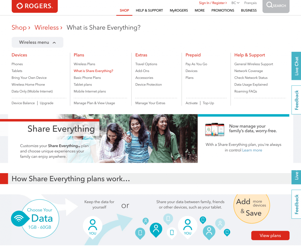
This typically happens because they don’t have a single, clear goal for their landing page. The instant a visitor lands on your page, your goal should be to get them to do one thing, and one thing only: click that CTA button.
You might have other awesome content and offers that you want them to see, but every “other thing” you dangle in front of your customer is a reason not to convert. Never give them any reason not to convert. Give them a button to click instead – one that encourages lead conversions.
20 | Give people something in return for their contact info
No matter how much leads like what you’re offering, they’ll always be a little hesitant to hand over their personal information “for no reason.”
Sure, you’re going to give them a good reason as soon as you get in touch. But still: handing over “something for nothing” feels a little cheap, a little too easy.
You can hugely boost your conversions just by giving people a little something in exchange for their personal info. You know, so it feels more like a trade. It doesn’t have to be anything major. Just something that feels exclusive:
- An ebook
- A special report
- A free consultation
- A specialized assessment
- A contest entry
- A small product sample
- Free beer! (Hey, we can dream…)
The list goes on and on. Spend a little time developing a free product or service to give your prospects, and you will undoubtedly see a lift in lead conversions. And when you reach out to the prospects you’ve converted, they’ll be all the more ready to listen, since you’ve already helped them for free.
21 | Run A/B tests on your landing page
If you owned a restaurant, you wouldn’t serve the same dish to every customer, would you? Of course not. You’d test different variations of every dish on the menu – and the most popular variations of your best dishes would become your “house specialties.” Landing page optimization follows a similar principle.
If you try to serve the same version of the same page to every visitor, you’ll convert a few – and miss out on the opportunity to win a lot more happy customers. Running A/B tests is simpler than it sounds. All you need to do is create two (or more) variations of your landing page. Then set up your site to serve each variation to visitors at random, and find out which performs better.
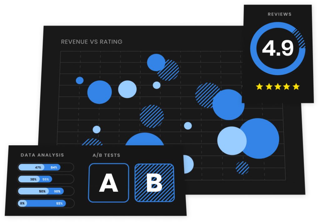
But here’s the key:
Only test changes to ONE page element at a time.
When you find out which of two (or three, or four…) CTAs performs best, then stick with the ONE top-performing CTA, and move on to testing two (or three, or four…) headlines. And so on. The more you A/B test, the better you’ll understand how to convert your visitors. And the whole time you’re testing, your conversions will keep rising.
22 | Create different versions for different customer segments
Just as you can (and should!) A/B test different headlines, CTAs and other page elements, you can (and should!) create and test pages targeted at different customer segments.
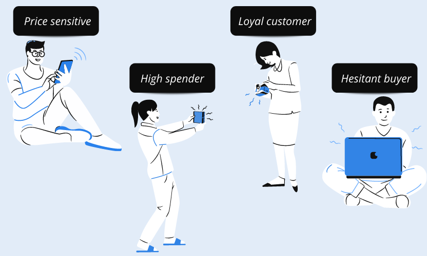
Maybe college guys want to buy your shoes because they’re great for trekking across campus. And maybe middle-aged dads love them because they’re comfortable for golfing. Starting with each of those specific benefits, craft a headline, CTA, and page message around the things each customer segment values the most. Then A/B test every possible variation of every element on those pages.
Over time, you’ll not only get a boost in conversions overall, but you’ll also get a hell of a lot more unique conversions from each segment. That makes all this testing for your landing page optimization more than worth your while.
23 | Share a video (that people actually want to watch)
Customer photos and product shots aren’t the only “hero” images out there. Videos have been popular hero shots since the earliest days of the web. Problem is, not everybody understands how to use them effectively.
If your video’s preview freeze-frame is just a shot of a car (or a computer, or… just about anything else) with a “play” button, your prospect has NO REASON to watch it. You’re basically asking them to spend two minutes of their life watching something that may have absolutely no value for them. So that’s the first step: make sure your video is actually helpful.
Now, maybe your video is helpful. Maybe every second of those two minutes is jam-packed with useful tips, meaningful statistics, awesome music, beautiful people and epic explosions. In that case, you need to give every visitor a specific reason to click that “play” button.
One easy way to do this is to overlay your headline on the video (if it’s relevant to the video, obviously). Or, if it’s not too distracting, come up with a subhead that highlights a benefit of watching the video. Remember – just like with your headline – start with the visitor’s main goal.
For example, if your visitor wants a great deal on car insurance, title the video, “Save 40 percent on your car insurance, today,” and title the “play” button “Find out how.”
Just make sure the landing page doesn’t rely solely on the video to get its message across. No matter how awesome your tagline is, not everyone will want to play it – and some visitors may be in a quiet room where they can’t.
Still, watching a well-made video can be a lot easier than reading a page of copy.
24 | Consider using exit popups… sometimes
We’ve all encountered them now and then: those little popups that appear at the moment you hit the “back” button, or try to close the window: “WAIT! You can still save 10%…”
These little guys can be highly effective when used in the right context – but we don’t always advocate using them. Why not? Because when used in the wrong context, they can be super annoying, and turn away customers who might’ve converted over the longer term.
To use exit popups wisely, you need to have a clear understanding of why your audience is bouncing away from your landing page. If they start to leave, but come back and convert when they get the exit popup, chances are your landing page’s headline and CTA aren’t getting your message across.
On the other hand, if they leave and don’t come back, it’s probably safe to say your exit popup turned them off for good. In other words:
We really only advocate using exit popups as a tool, to help figure out where and why people are bouncing off your page. Other than that, stay away.
Yours truly, ConversionAdvocates
25 | Point your visitors in the right direction
You’ve put together a brilliant headline, an eye-catching hero shot, and a CTA that’s impossible to ignore. What’s left for landing page optimization?
Maybe nothing – except a little indication of where you want your visitors to look. After all, if you just let their eyes wander anywhere, they can easily wander to that “back” button. Directional indicators can be simple – sometimes as simple as an arrow, pointing directly at the CTA.
Sometimes, though, a big shiny arrow is a little too loud. You can still get away with a small arrow (or arrow-like shape) pointing below the fold, as a way of saying, “Hey, look, there’s more down here!” If people in your photos seem to be looking toward a corner of the page, their gaze can subtly guide visitors to look at a special offer, paragraph, or CTA.
Try a few directional cues, and you’ll find that visitors are surprisingly easy to guide with a few simple shapes. Just keep it simple and subtle, and they’ll look (and click) right where you want them to.
26 | Draw attention to the most important elements
This definitely doesn’t mean big yellow stars and neon pink text. “Attention-grabbing” is not a code word for “ugly.”
We’re talking about contrast. Your headline, CTA, and (maybe) one or two more important elements should stand out from the background, and from the rest of the content on the page.
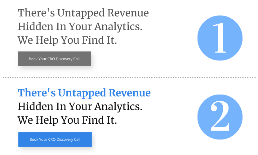
See the difference? The visitor will naturally look at these elements first. So choose carefully.
Also, you’ve obviously got some limits on the number of “most important” elements that’ll stand out. Two or three is usually the max. Once you’ve picked out the page elements your user absolutely has to notice, call them out with bold fonts, contrasting colors, maybe even a shadow or two. The easier it is for a visitor to focus on the benefits, the easier it is for them to convert.
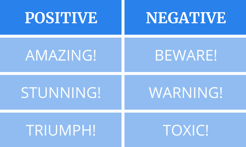
27 | Keep everything positive
Why are there so many landing pages that seem to list all the things the company won’t do?
“We won’t spam you.”
“We’ll never waste your time”
“We swear we don’t dress up like scary clowns and frighten people for fun.”
Most likely, visitors weren’t even thinking about those things, until the site brought it up! In fact, a lot of pages use an overwhelming amount of negative language:
“NO money down.”
“You’ll NEVER get a better offer”
You might start with the very best intentions… but after a page or two of relentless negativity, your visitor is going to start thinking in terms of “no.”The only time you should ever use negative language is when you’re calming a specific worry that you know your audience feels. Even then, try to phrase it positively if you can. After all, this world needs a little more positivity, don’t you think?
Some Final Thoughts
As you might have noticed, most of these tips don’t recommend adding anything to your page. Just the opposite: they recommend things to remove, so your page can get out of its own way and start converting leads like never before.
But it’s tough to make cuts to your beloved page – this beautiful creature you worked so hard on. We know, we’ve been there. That’s exactly why we’re here: to give you one-on-one guidance on building a landing page that fits perfectly into your conversion funnel – so your leads click, convert, and tell their friends.
When you’re ready to take your sales to the next level, get in touch. We’ll talk about turning your website into a high-powered conversion factory.