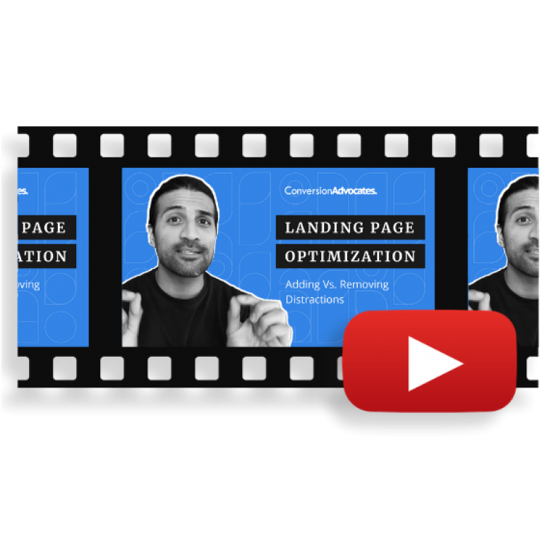
a 2-minute read
User experience optimization is one of the hottest topics out there. Numerous experts predict this trend rapidly rising in the upcoming years. The reason is very simple: We live in a customer-centric period. All businesses depend on customers and clients, which is why it’s so important to optimize everything to fit their needs, preferences, desires.
Unfortunately, many lose their own identity in the process of tailoring everything they have to fit a broad audience.
We won’t let this happen to you!
How to Start Landing Page Optimization?
One great way to start looking for opportunities for optimization and A/B testing on your landing pages is to answer the question:
“What is the primary action you want your users to take?”
Once you answer this question, you’re ready to begin experimenting. Yes, we’re referring to split testing, also called A/B tests.
How to Start A/B Testing on Your Landing Page?
When it comes to landing page optimization, the best way to start experimenting is to start the A/B test by removing distractions.
This is a standard landing page optimization practice which gets users to really focus on the action you want them to take.
So if it’s standard practice, why test it?
Because it depends on numerous factors such as:
- What is your product?
- Who is your audience?
- Where are your leads in their buying journey?
Counting in all these factors, and running A/B tests will help you determine whether:
- One-action-only minimalistic landing page
or
- Tons of links and distractions that will provide your users with opportunities to research
is the right option for you.
Is There an Ideal Landing Page Design?
The answer is: no, there isn’t a one size fits all solution. The ideal landing page design that will lead to an increase in conversion rates depends on:
- Your target audience
- The product that you offer
This is why, if you’re determined to do everything on your own, you’ll need to start doing a lot of experiments. Understanding your target market, and having a profiled buyer persona will help you a great deal. But, in the end, it all comes down to conducting tons of tests.
The goal of each A/B test and experiment is to learn something new or confirm what you already thought. Like our IIEA framework states, the experimentation phase offers you a chance to gather information, and translate it to actionable intelligence. There is no reason to make a decision based on your opinion. Test – and act on results.
Some Final Thoughts
Don’t be afraid to challenge your assumptions.
Never forget that you depend on your customers and that we live in customer-centric times. Make sure to invest in user experience optimization before it’s too late. Losing potential customers because they had a bad user experience on your website is very hard to recover from.
To put it simply: bad UX (user experience) means low conversions. Good user experience means higher conversions. Optimizing your landing pages for conversions will help you fix common UX mistakes.
To help you get started, we’ve created a list of 27 tips that will help you optimize your landing page design and enhance user experience right away.


