How Math Worksheet Land increased sales conversion rate of membership [AGAIN] by 54% in a single experiment


This case study is about how ConversionAdvocates increased sales conversion rate of Math Worksheet Land yearly recurring membership plans by 54% in a single experiment.
Math Worksheet Land has the largest selection of math worksheets on the internet for teachers and tutors with students from preschool to high school.
How does removing distractions on the Sign-Up page impact the engagement and sales conversion rate of membership plans?
Micro Conversion Increase payment page views.
Macro Conversion Increase sales conversion rate of membership plans.
People are used to spending time and searching the website before visiting the Sign Up page. This user behaviour pattern is causing them to get distracted from taking action because of the number of options to continue searching on the Sign Up page.
If we remove the number of options available to the users on the Sign Up page then they will be more likely to complete the form and convert into a sale.
Google Analytics, Google Optimize
A/B Test
2
ConversionAdvocates
Math Worksheet Land visitors are very motivated before purchasing, typically visiting many pages before heading to the Sign Up page. The problem is when they get there they’re still not signing up, choosing to continue browsing the website instead.
Using our proprietary IIEA framework we were able to uncover opportunities to increase sales conversion rates of Annual Membership over 52% in a single experiment.
Having worked Math Worksheet Land on several successful experiments, we had a clearer idea of what they did and did not like. And it’s by leveraging these unique user behaviour insights that we were able to identify what opportunities to explore further.
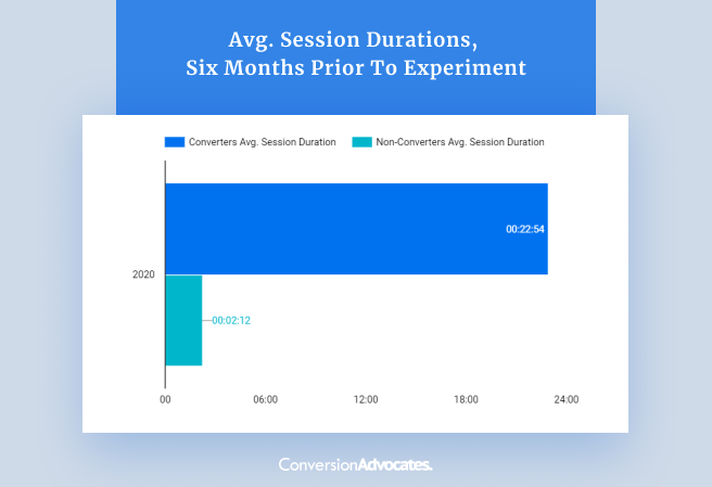
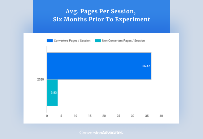
Insight #1 | Users who convert visit an average of 36 pages and spend 24 minutes on the site. They are highly engaged and like to spend time reviewing the site’s content and materials before making a purchase. This insight demonstrates a strong interest and buying intent from visitors who visit the Sign Up page, but it also indicates a unique user behaviour trait we need to eliminate at the sign up stage.
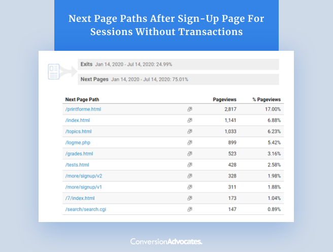
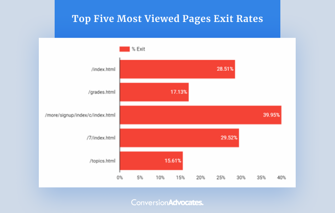
Insight #2 | Users who visit the Sign Up page and DO NOT convert typically visit the home page, the topics page, or the grades page as their next page path.
Insight #3 | Exit rates on the sign-up page were 59% higher than the site average during the three months prior to this experiment. 40% of all visitors to the sign-up were leaving the website on this page.
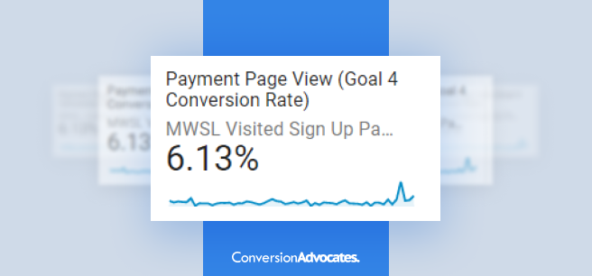
Insight #4 | Only 6.13% of sign-up page visitors were clicking through to reach the payment page, the desired action on this page.
Based on the findings, we formulated our primary hypothesis for the experiment.
If people had less distractions and opportunities to click off the Sign Up page then they are more likely to complete the sign up form and purchase.
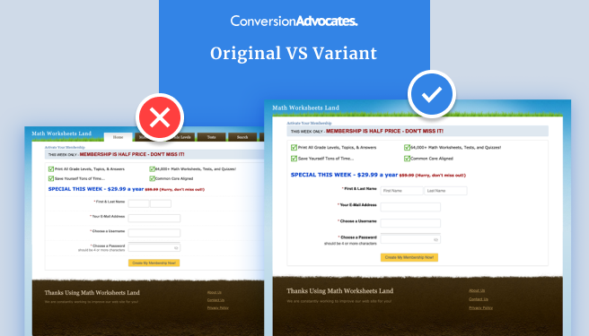
For this experiment, we created an optimized variant of the Mathworksheetland.com Sign Up page in an attempt to increase the form completion.
The major highlight of the experiment variation was:
After running the experiment for 27 days, our hypothesis was proven TRUE with a 97% confidence level that the results will continue.
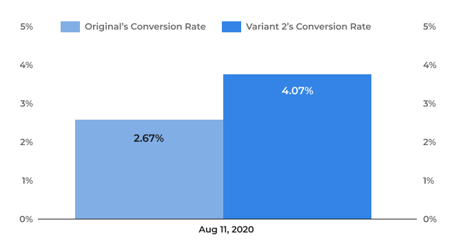
The new sign-up page converted 53% higher than the Original during this experiment.
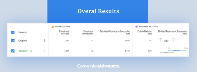
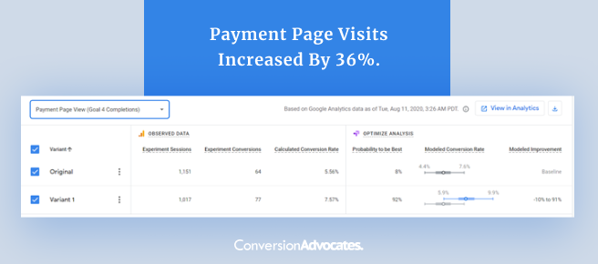
Payment Page visits increased by 36%.
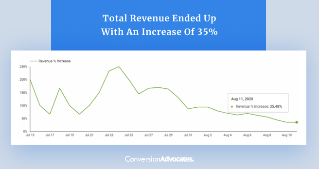
Total revenue ended up with an increase of 35%. There was a positive revenue increase for the Variant throughout experiment duration.
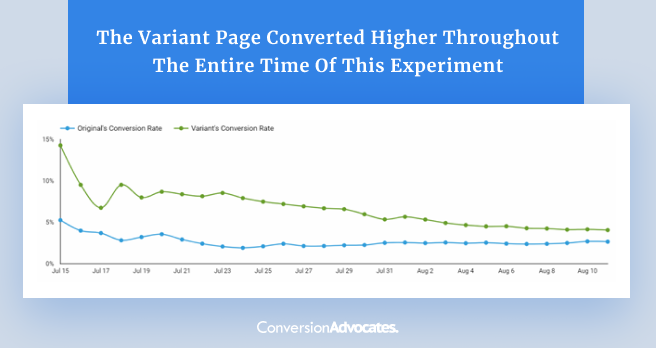
Conversion rates over time. The Variant page converted higher throughout the entire time of this experiment, we kept the experiment running in order to achieve a statistically significant sample size.
Want to hear what the owners of Math Worksheet Land had to say about working with ConversionAdvocates teams?
Check out their telephone VERIFIED Review on Clutch.
Remove Obstacles To Conversion For Your Customers And Achieve Triple Digit Growth
Our Process Drives Consistent and Measurable Growth. We Build You An ROI Positive CRO Program In 90 Days
Book Your FREE Growth Strategy Call
Remove Obstacles To Conversion For Your Customers And Achieve Triple Digit Growth
Our Process Drives Consistent and Measurable Growth. We Build You An ROI Positive CRO Program In 90 Days